We must see 20 of these date architecture diagrams in out LinkedIn
every day:
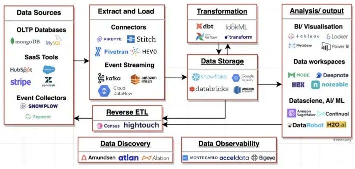
These boxes and arrows do not reflect the real cause of data problems and, more importantly, do not reflect the size of the problems. That innocent little arrow says we’ll take all the ‘raw data’ (love that phrase), and magically turn it into something meaningful. That little arrow represents a few hundred systems, each with (on average lets say) 100 tables with 20 columns in each. That could easily add up to 100,000 decision points, which is 5 years work for a team of 6 expensive data engineers. And that’s just one arrow.
Every arrow in a diagram indicates there’s been a mistake. Or to put it another way, someone didn’t design something properly or at all. Magnify the arrow and see what’s under the hood, and you will see the size of the mistake. Any software vendor selling you arrows is selling snake oil.
Arrows are history and convergence is the future:
The way to rid yourself of arrows is to develop a data centric strategy that starts at the beginning of the data lifecycle. This loops us back to the Joe Reis convergence diagram in our previous article (below) and provides the path to a data world without arrows.
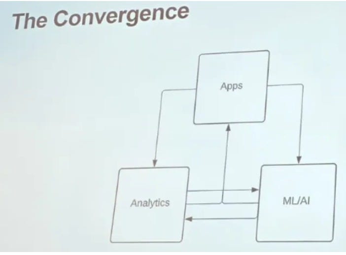
Joe Reis’s convergence diagram
For this to happen, the entire data life cycle from operational data to analytical data to data science, all needs to be controlled as a layer of unified data.
We call this data centric information design.
And this is exactly what the Occam Data Framework does.